


I don’t know about you, but I love fonts! I’ve hoarded thousands of them on my computer and yet I’m still scouring my favorite font merchant sites for more. It’s gone beyond just hoarding other people’s fonts now though to the point that I’m starting to dip my toes into the wild river of typeface design and font creation and I fully expect to be swept away by it!
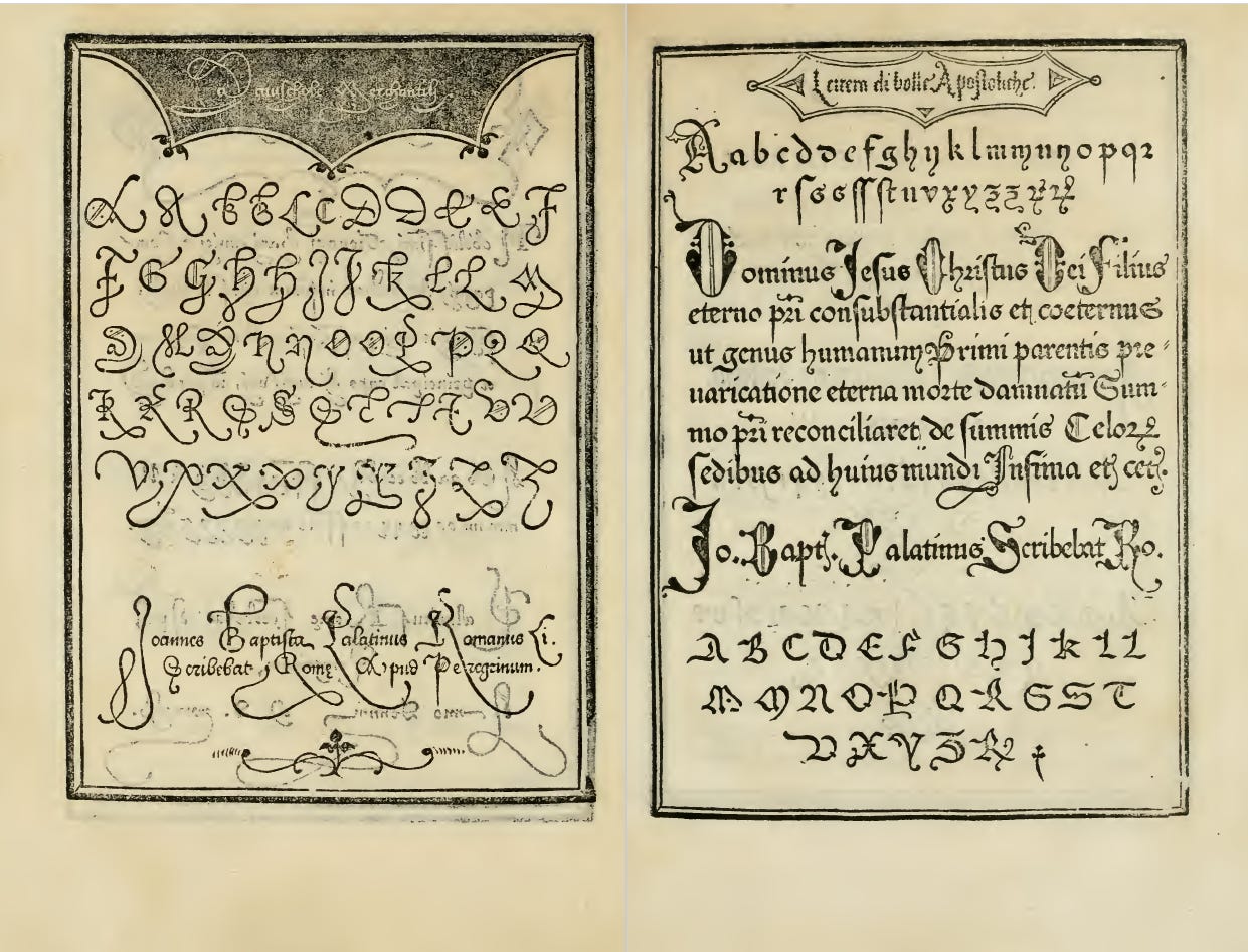
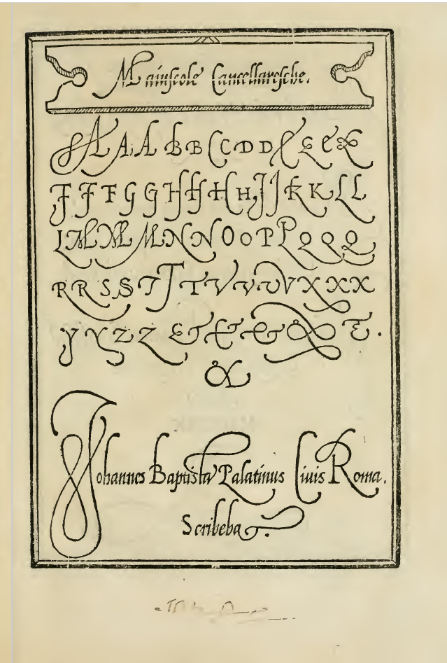
I briefly dabbled with it in the past with badly drawn letters in Inkscape and trying to use a crash happy Font Forge software to turn them into an actual font, but now I’m back to the idea as it still fascinates me. I’m coming at it a little differently now though. I’m building a visual library of beautiful, old letterforms by photographing the covers of beautiful old books in antique stores, flea markets, and anywhere else I find them along with any other ephemera or object with interesting text on it that might prove useful for inspiration. I’m also keeping an constant, longing eye out for the old type specimen books and the like, but, sadly, these are extremely hard to come across. However, I have a lovely little (not actually that little) digital library courtesy of my parents who gifted me a collection of digitized antique books on lettering, decorative penmanship, alphabets, and the like from the 1920s and as far back as the mid 1500s.
Just before my family went on vacation this year I printed out a bunch of pages from one of those books to start practicing and experimenting with ideas. Here are a couple of them.
And here’s my first very, very rough experimentation using these (and other) pages as inspiration.
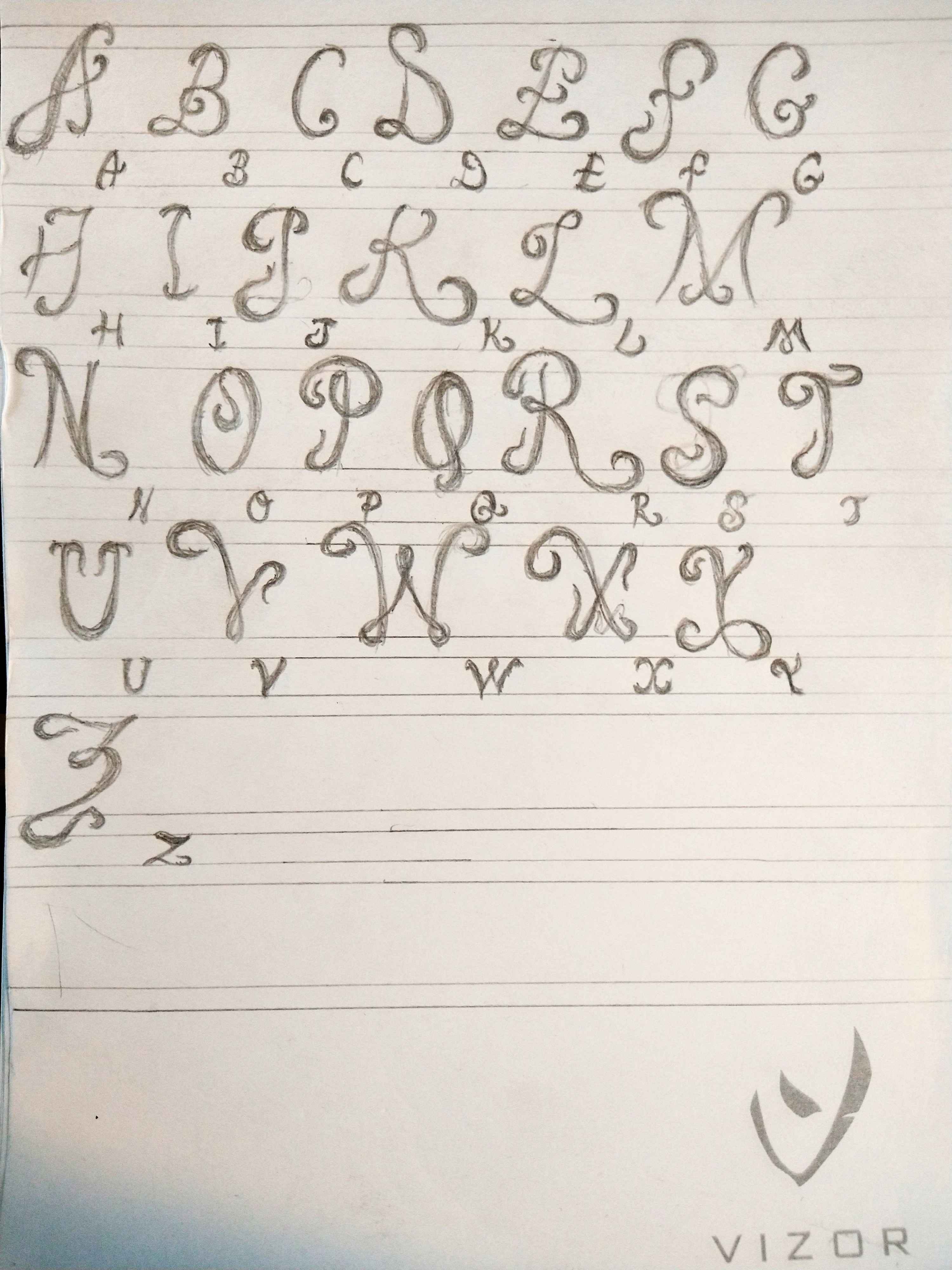
It’s in need of a lot of work (height consistency is awful even with my vaguely sketched guidelines), but I actually kinda like where some of these letters were going. It’s technically an ‘all caps’ concept sketch, which is often the easiest to start with (or at least according to the books I’ve read on typeface design), but I still tried for an ‘upper’ version along with small caps.
My second design sketch ditched the books altogether and went in a very, very different direction! Steampunk.
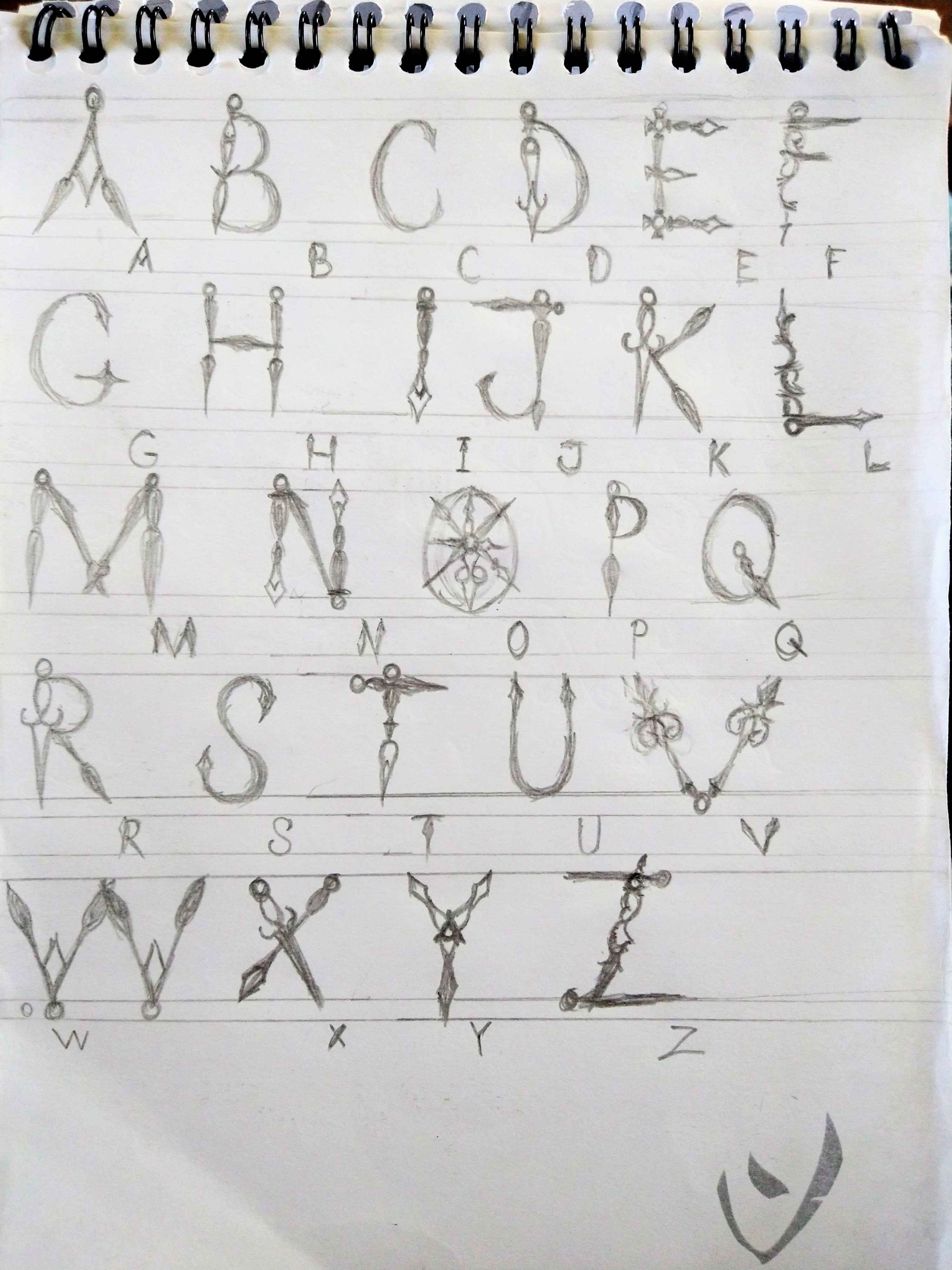
Again, a lot of work is still needed before I can even consider bringing anything over for vectorizing and turning into an actual font, but I really rather like the idea of this one! I scoured the internet for reference pictures of old clock hands and worked off of them. I’m also working on a letterform design concept based on gears, but that one’s only partially sketched out right now.
So, what do you think? Back to the drawing board or do you think they have potential?
I, of course, am partial to the Steampunk font. I am dangerously inspired now.
I think they look beautiful! I’ve only casually tried creating my own fonts, just for handwriting, but it’s fun.